Fashion has long been a realm of abundant creativity, yet beneath the glamour lies a powerful and often underestimated foundation: typography. The visual language used by luxury brands is not merely decorative; it is integral to their identity promise. Charles Nix, senior executive creative director at Monotype, sheds light on this crucial role in couture, tracing the heritage of fashion type from past trends to future challenges.
The Evolution Beyond Fleeting Trends
Fashion houses—whether century-old heritage brands or modern newcomers—have continuously adapted their visual identity. The so-called “great sans scare” that swept through the 2010s, which prompted many brands to simplify their typefaces for digital platforms, was largely a temporary adaptation rather than a permanent shift. While the pandemic accelerated the need for digital-first experiences, forcing websites into prominence, this often led to minimal, predictable designs using standard sans-serif fonts and ample white space.
However, Nix notes that these momentary simplifications did not erase distinctive brand voices. Instead, they highlighted the necessity of a strong underlying mark. The logo and its associated typography function as anchors; they hold fast to the unifying idea of the brand while the seasonal garments and trends evolve around them.
- The logo endures, providing stability amidst ephemeral fashion cycles.
- Digital platforms became the design equivalent of physical retail spaces, demanding clear mnemonic devices.
- Distinctive marks are returning in strength as brands navigate standardized AI environments.
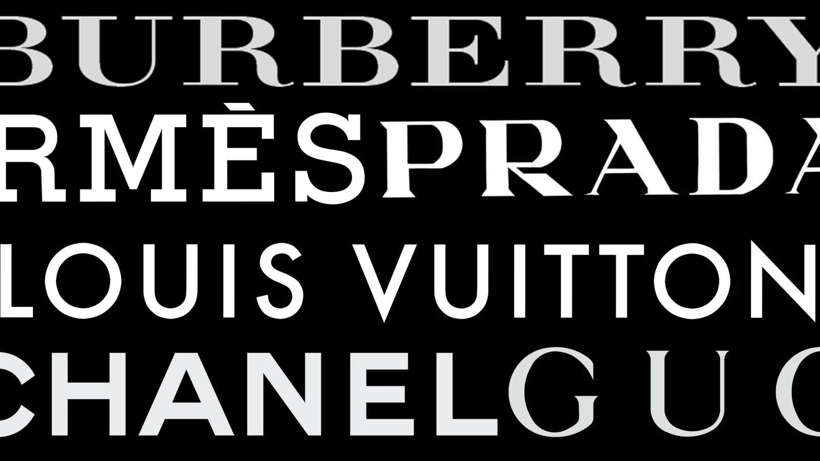
Typography: The Brand's Enduring Anchor
Fashion houses lean heavily into typography because the label—the logo—is an icon that stands for a long-term promise within an inherently transient industry. While visual imagery and garment design change with every season, the typographic system provides consistency. This stability is vital as brands seek to maintain recognition across diverse market segments, from high-end couture to streetwear.
A current trend observed in luxury branding is the wave of “blandification” within logos. Some observers question whether this represents a loss of individual heritage or if it is a calculated strategic move. The evidence suggests that this simplification may be allowing the broader typographic system—the overall visual language and font choices—to carry the heavy lifting of brand recognition, rather than relying solely on an overly complex mark.
Ultimately, typography ensures that even as fashion changes season by season, the core identity remains recognizable to the consumer. The careful selection and deployment of typefaces are therefore not just aesthetic decisions; they are strategic business choices that define a brand's longevity in a volatile global market. A well-executed typographic system provides the necessary permanence for an industry built on constant change.