According to Macworld, the upcoming macOS Golden Gate serves as a corrective evolution of the significant user interface changes first seen in macOS Tahoe. While the previous iteration was a bold departure for Apple's desktop environment, the current developer beta suggests that the company is now focusing on fine-tuning those elements to improve usability and visual consistency across the ecosystem.
Refined UI elements and Liquid Glass effects
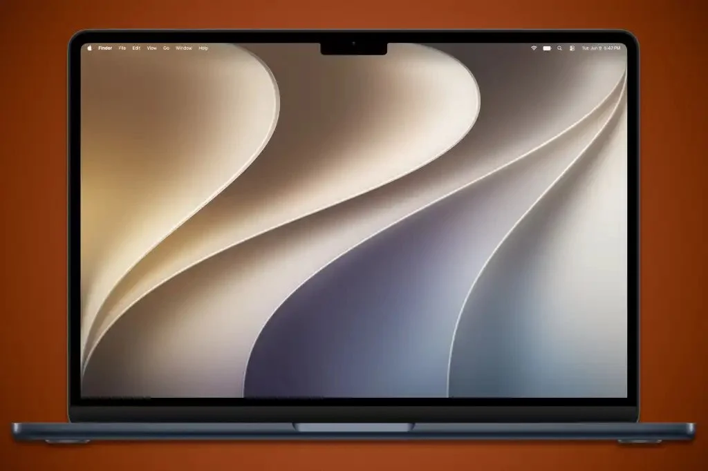
One of the most notable changes involves the "Liquid Glass" aesthetic. Users will now have more granular control over this visual style through a dedicated setting in System Settings under the Appearance tab. This allows for adjustable transparency levels, giving users the ability to balance depth with readability. Additionally, Apple is applying these new effects to app icons, a trend already visible in the updated Maps application icon within the beta.
The update also addresses structural inconsistencies found in previous versions:
- The Finder sidebar has transitioned from a "floating" style to a fully shaded column for better visual grounding.
- Window corners have been standardized to ensure a consistent look across all native applications.
- Menu items have been decluttered by removing unnecessary icons, resulting in a cleaner and less crowded navigation experience.
Enhanced icon clarity and contrast
Apple is also addressing complaints regarding the "softness" of certain visual elements. The Golden Gate update introduces higher contrast and sharper definitions for core system apps. Specifically, icons for the App Store, Automator, FaceTime, and Siri have been modified to include more distinct outlines and borders. These changes are designed to make navigation more intuitive by providing clearer boundaries between different interactive elements on the screen.
While these represent the first set of adjustments in the developer beta, Apple may continue to iterate on these designs before the official public release later this year. The shift toward higher contrast and customizable transparency suggests a move toward a more flexible design language that accommodates diverse user preferences for accessibility and aesthetics.