When finalizing a brand identity—after the logo and color palette are established—a subtle issue may persist. This often stems from typography: two excellent typefaces can undermine the entire design if their relationship creates low-level visual friction. Font pairing is crucial for establishing tone, hierarchy, and coherence across all touchpoints.
The Danger of Overly Similar Typefaces
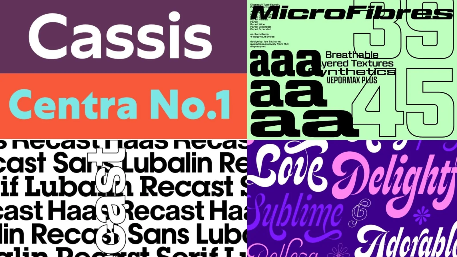
One frequent error involves selecting two fonts that are almost identical but not quite. For example, using two geometric sans-serifs that share a general feel but differ only in minor details like x-height or terminal shape. Charlie Beeson, design director at FutureBrand, notes that pairing such similar typefaces does not appear as an intentional choice; it reads as a mistake.
Alice Munday, design director at Curious, agrees, explaining that using fonts too close in style can create a disjointed feeling and suggests the decision lacks intention. Instead of seeking subtle variations, designers must ensure the contrast between paired typefaces is deliberate and immediately readable to the viewer. As Beeson advises, if the hierarchy is not obvious, the design reads as an accident.
Defining Clear Roles for Each Font
Even a perfectly chosen pairing can fail if the function of each typeface within the visual system remains vague. When designers do not know when or how to use specific fonts, inconsistency creeps into the brand across various touchpoints, weakening overall coherence.
Natasha Lucas, a designer specializing in visual identity, emphasizes that problems arise precisely when these roles are left undefined. Designers may begin using typefaces interchangeably, which dilutes the recognition of the brand voice over time. Mat Desjardins, founder and creative director at Pangram Pangram, stresses that function must always take precedence over mere aesthetics.
- Focus on Behavior: Instead of pairing fonts solely because they share surface traits like sharp terminals or quirky details, designers should focus on how the typefaces behave in a layout.
- Consider Purpose: Evaluate their proportions, spacing, texture, and specific purpose within the design system.
- Elevate the Design: When pairings contrast well, each font elevates the other, ensuring every element has a clear role to fill.
Ultimately, successful typography is not about finding two different fonts; it is about selecting typefaces that are different enough to make the entire composition stronger and more purposeful.
Conclusion
Mastering font pairing requires moving beyond surface-level aesthetics. By defining distinct roles for each typeface and ensuring deliberate contrast, designers can transform a collection of good fonts into a cohesive and authoritative visual language.