The Harold Stevens Gallery is currently developing a new brand identity with the assistance of students from Clark University's studio art program. The gallery, situated steps from campus inside WCUW 91.3 Community Radio, was established to showcase both emerging and established artists while functioning as a community hub for exhibitions, performances, and educational events.
The Scope of the Design Project
According to Clarku, students participating in Sherry Freyermuth’s Identity in Practice course were tasked with designing new logos. The resulting concepts were displayed at the gallery from April 20 to April 23, allowing visitors to vote on their favorite designs. This process provided students not only with creative challenges but also practical experience in client relations and accepting critical feedback.
Student Approaches and Creative Challenges
Three notable student projects highlighted the diversity of approaches taken during the design phase:
- Sophie Lee ’26: The popular vote winner, Lee focused on typography rather than imagery. She sought a simple yet unique aesthetic by experimenting with overlapping letters to encapsulate the gallery's wide array of artists and shows.
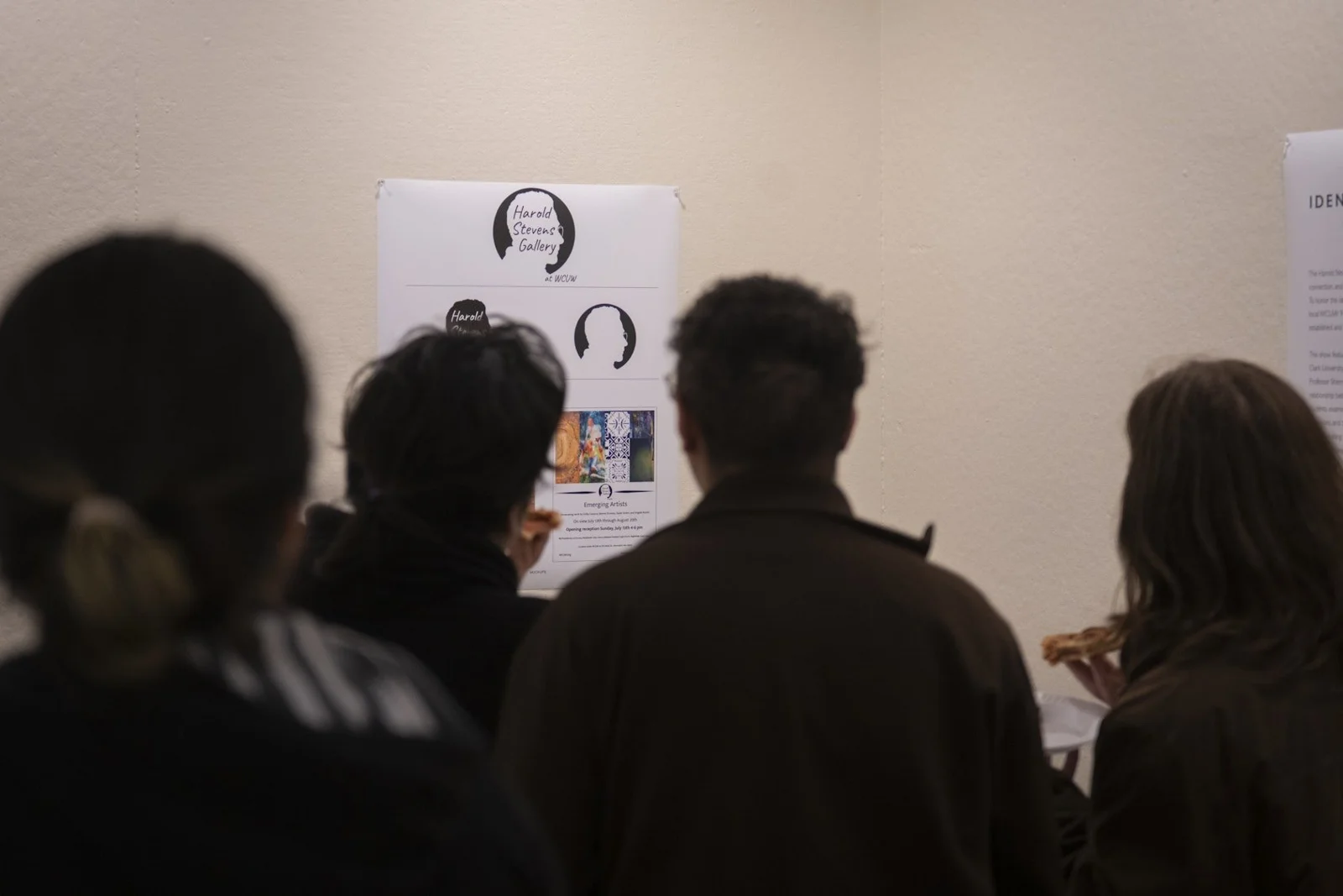
- Manny Torto ’27: Torto opted for a bold style that framed the text "Harold Stevens Gallery at WCUW" around a silhouette of Harold Stevens. He noted that his goal was to evoke a sense of the late donor’s legacy, even without having met him personally.
- Beverly Peterson ’26: Peterson chose a window-like design featuring rectangular panes, reflecting the gallery's function as an "open window" for emerging artists in the community.
The students involved reported that the process of refining their concepts was highly valuable. Manny Torto stated that his biggest challenge was toning down his initial ideas, which he overcame by constantly seeking input from peers and asking questions like, “How could I make this better?”
Impact on Community Identity
Ann Souza, a WCUW board member and co-curator of the gallery, emphasized the significance of the partnership. She noted that incorporating Clark students into the project was meaningful because it honored WCUW’s history—which originated on the Clark campus—while providing practical exposure to student designers. Souza added that Lee's winning logo is instrumental in creating a stronger and more recognizable visual identity for the gallery, helping communicate its mission across digital platforms and physical exhibitions within Worcester’s contemporary arts community.
Ultimately, this collaboration successfully merged academic design principles with real-world cultural needs, reinforcing the role of art institutions as dynamic centers for both creative expression and educational growth.